
When choosing lighting fixtures, most people focus on brightness and energy efficiency. However, an equally critical factor is color temperature in lighting design. This parameter not only affects the aesthetic appeal but also influences human health and well-being.
What is Color Temperature?
Color temperature is a fundamental concept in lighting that quantifies the hue of a light source, expressed in degrees Kelvin (K). It refers to the perceived color of the light emitted by a source when it is heated to a specific temperature. The concept originates from the work of Max Planck, a German physicist who formulated Planck’s law in the early 1900s. This law describes how a black body radiator emits electromagnetic radiation at different temperatures, revealing that as the temperature increases, the color of the emitted light shifts from red to blue.
In practical terms, color temperature helps categorize light sources into warm and cool tones. For instance, a candle flame emits light at around 2000K, giving off a warm, golden hue. In contrast, midday sunlight, which has a color temperature of approximately 5500K to 6500K, appears bright and bluish.
This range is crucial for various applications in design and architecture, as it affects not just aesthetics but also mood and functionality. Warm light is typically used in spaces designed for relaxation, such as living rooms, while cooler light is favored in work environments where focus and alertness are essential. Understanding color temperature allows designers and consumers to make informed decisions that enhance both the visual appeal and practicality of lighting in any given space.
Key Color Temperatures
Color temperature ranges from about 2000K to 8000K, each with distinct characteristics that influence the ambiance and functionality of a space. Here’s a closer look at common color temperatures and examples:
2000K (Candlelight):
Candlelight produces a warm, soft glow that evokes feelings of comfort and intimacy. This low color temperature is ideal for settings like dining rooms and bedrooms, where a cozy atmosphere is desired. It enhances warm colors in decor and creates a serene environment.2800K to 3400K (Tungsten/Incandescent):
Tungsten bulbs, often referred to as incandescent lights, fall within this range and emit a warm white light. This is the most common choice for residential lighting, suitable for living areas, hallways, and task lighting. The warm tone complements wooden furniture and soft textiles, making spaces feel inviting.4000K (Fluorescent):
Fluorescent bulbs typically emit a neutral light around 4000K, which is ideal for commercial spaces, offices, and schools. This color temperature balances warmth and coolness, promoting alertness while still being comfortable. It’s effective in areas where productivity is a priority, such as workstations and classrooms.5600K to 6500K (Daylight):
Natural daylight ranges from approximately 5600K to 6500K. This bright, bluish light mimics the sun at midday and is perfect for environments that require accurate color perception, like art studios and photography. Daylight-balanced lighting enhances clarity and detail, making it essential for tasks that demand precision.8000K (Moonlight):
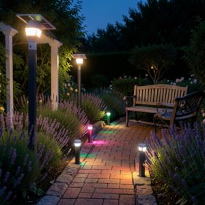
At around 8000K, light sources resemble the cool, bluish hue of moonlight. This high color temperature can create dramatic effects in design, often used in landscape lighting or theatrical settings. While it’s not typically used for everyday indoor lighting, it can add unique ambiance to outdoor spaces.
Importance in Design
Understanding color temperature is essential in design as it significantly influences atmosphere, health, and productivity within a space. Here’s how each aspect plays a vital role:
Influence on Atmosphere:
The color temperature of lighting can transform the mood and feel of a room. Warm light (around 2700K to 3000K) fosters a cozy, inviting atmosphere, making it ideal for living rooms, bedrooms, and dining areas. This warm ambiance encourages relaxation and social interaction. Conversely, cooler light (4000K to 6500K) creates a more vibrant and energizing environment, suitable for kitchens, offices, and retail spaces where alertness and engagement are paramount. By carefully selecting the color temperature, designers can craft spaces that evoke specific emotions and enhance the overall experience.Impact on Health:
Color temperature also affects human health and well-being. Exposure to certain light temperatures can influence biological rhythms, including the sleep-wake cycle. Warm light in the evening promotes relaxation and prepares the body for sleep, while cooler light during the day helps maintain alertness and focus. Research has shown that prolonged exposure to blue-rich light (4000K to 6000K), especially in the evening, can disrupt melatonin production, leading to sleep disturbances. Thus, using appropriate color temperatures at different times of the day can support better health and well-being.Enhancement of Productivity:
In work environments, the right color temperature can significantly enhance productivity. Cooler, daylight-like lighting (5000K to 6500K) has been shown to improve concentration and reduce eye strain, making it beneficial for tasks that require attention to detail. Many offices utilize fluorescent lighting in this range to boost energy and efficiency among employees. Conversely, warmer light can be used in collaborative spaces to create a more relaxed atmosphere, encouraging creativity and teamwork. By strategically employing color temperature in workplace design, organizations can create environments that optimize performance and employee satisfaction.
Choosing Lights by Color Temperature
Selecting the right lighting based on color temperature is crucial for creating the desired ambiance in any space. To make informed decisions, consider the following factors:
Room Functionality:
Different rooms serve different purposes, and the lighting should reflect that. For example:- Living Rooms and Bedrooms: Warm color temperatures (around 2700K to 3000K) are ideal for these spaces, promoting relaxation and comfort. They complement cozy furnishings and create an inviting atmosphere for socializing or unwinding.
- Kitchens and Dining Areas: A slightly cooler temperature (3000K to 4000K) can enhance visibility for food preparation while still maintaining a welcoming feel during meals. This range helps to highlight colors in food and decor.
- Home Offices and Workspaces: Cooler white light (4000K to 5000K) is best for promoting focus and productivity. It mimics natural daylight, reducing fatigue and enhancing clarity for tasks that require concentration.
- Bathrooms: A bright, neutral color temperature (around 4000K) is useful for grooming tasks, providing clear visibility without being harsh.
Time of Day:
The time of day can influence the appropriate choice of color temperature.- Morning and Daytime: Cooler, daylight-like lighting (5000K to 6500K) is ideal for energizing spaces and supporting wakefulness. This lighting helps to replicate natural sunlight, improving mood and productivity.
- Evening: As the day winds down, transitioning to warmer light (2700K to 3000K) can help create a calming environment. This shift encourages relaxation and prepares the body for rest by signaling that it’s time to unwind.
Desired Ambiance:
Consider the mood you want to establish in each space.- Cozy and Intimate: Use warm light to create a snug atmosphere in social areas. Incorporating dimmable fixtures can enhance flexibility, allowing for adjustable brightness depending on the occasion.
- Bright and Energizing: For areas where activity is encouraged, such as home gyms or creative studios, cooler lights can help stimulate energy and alertness. Bright, neutral lights can also make smaller spaces appear larger and more open.
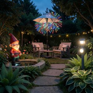
- Dramatic and Artistic: In spaces like galleries or theaters, lighting can be used strategically to highlight artwork or create a specific mood. Using a mix of color temperatures can add depth and interest, allowing for creative expression.
Conclusion
Incorporating the right color temperature in lighting design is essential for achieving a harmonious and functional space. Consistency in color temperature throughout a room helps create a cohesive atmosphere, enhancing overall design quality. Opt for warmer whites for relaxation and cooler whites for productivity to ensure that your lighting effectively